How Digital Color Grading Gave Modern Movies Their Teal and Orange Look
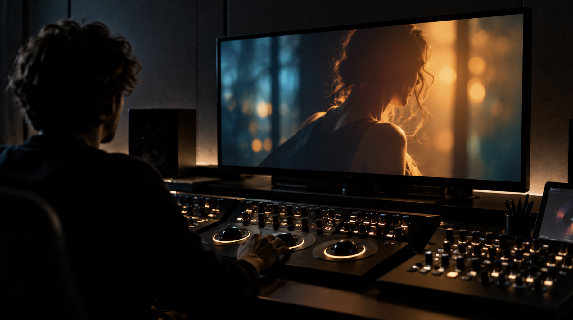
Once you notice it, it is hard to stop seeing it. Faces glow in warm amber, while the shadows, skies, walls and water around them sink into cool blue-green. Act...

Once you notice it, it is hard to stop seeing it. Faces glow in warm amber, while the shadows, skies, walls and water around them sink into cool blue-green. Action films, superhero franchises, thrillers and plenty of television drama share the palette so often that “teal and orange” has become shorthand for the look of contemporary commercial filmmaking. It is usually mentioned with irritation, as if someone in Hollywood had flipped a switch around 2007.
The real story is more interesting. The palette is not a single decision but the visible result of a technical shift: the move, over roughly a decade, from photochemical film finishing to the digital intermediate, and with it the arrival of the colorist as a central figure in how a film looks. Teal and orange is what happens when that power meets the physics of skin tone, the economics of mass-market imagery and the conventions of a new toolset. It is not a conspiracy and not an accident.
This article traces how color control moved from the camera and the laboratory to the grading suite, what the technology made possible, why one particular contrast became so common, and what the evidence does and does not show about how much films have actually changed.
When color was decided in the laboratory
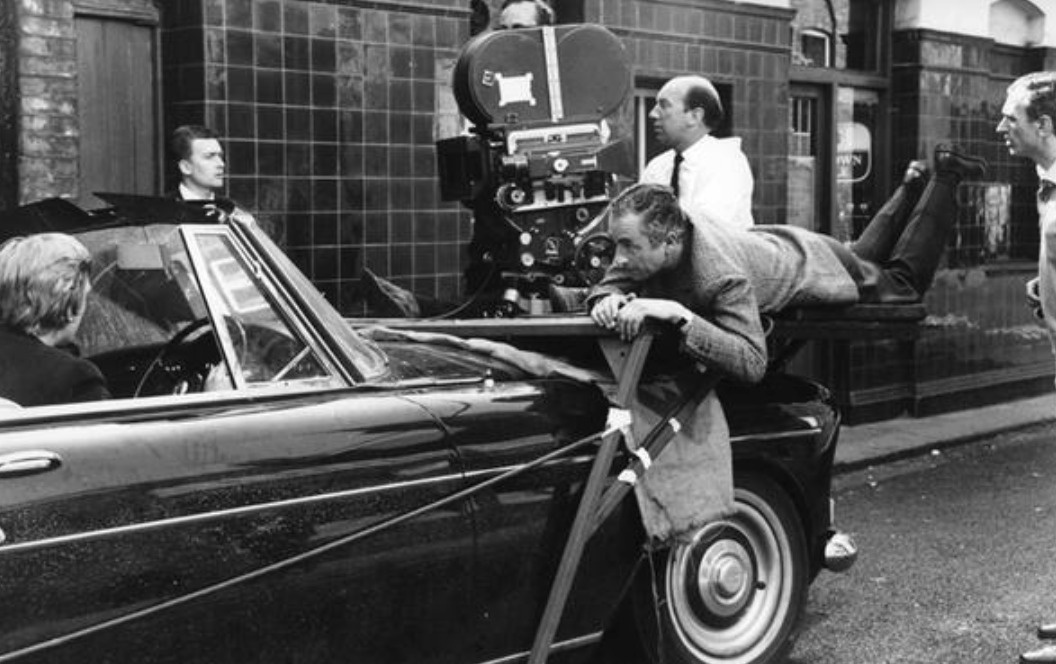
For most of the twentieth century, a film’s color was shaped in three places: in front of the lens, in the choice of film stock, and in the laboratory. The cinematographer controlled lighting, filters, exposure and the stock. Production designers and costume departments controlled what was there to be photographed. After shooting, the lab printed the camera negative onto positive film, and that step offered only limited control.
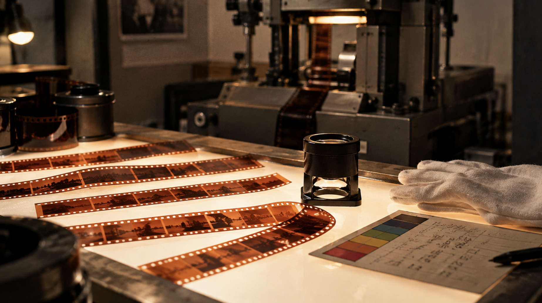
The main tool was printer lights. In a laboratory printer, light passes through the negative onto print stock, and its red, green and blue components can each be adjusted on a graduated scale of “printer points”. A color timer, the laboratory technician responsible for consistency, would assign each scene a set of three values to correct exposure differences and shifts in color balance between shots. Kodak’s guidance for timers describes a normally exposed grey card printing at 25-25-25. Timing was skilled and subtle work, but it was global. A change affected the whole frame. You could warm or cool a scene, make it lighter or darker, but you could not make only the sky bluer or only the grass browner.
Within these limits, the look of a film was mostly built physically, through lighting, filtration, stock choice, set dressing and costume. Some of the most distinctive palettes in film history came from processes rather than from postproduction choices. Three-strip Technicolor, used for the first time on a complete feature with Becky Sharp in 1935, produced its saturated color through dye-transfer printing, and the company’s color consultants, led by Natalie Kalmus, closely supervised how color was used on set.
Changing the chemistry
When filmmakers wanted a look the standard process could not give, they altered the chemistry itself. Bleach bypass, which skips or shortens the bleach step so that silver is retained alongside the color dyes, produces higher contrast, deeper blacks and reduced saturation. Michael Radford’s Nineteen Eighty-Four (1984), shot by Roger Deakins, is often cited as an early feature to use it on a large scale.
Laboratories developed their own silver-retention variants. Technicolor’s ENR process, named after the technicians Ernesto Novelli and Raffaele Raimo, was first used on Warren Beatty’s Reds (1981) and was later used on films by Clint Eastwood, Bernardo Bertolucci, David Fincher and Steven Spielberg, according to Technicolor’s own history. Deluxe’s CCE process was applied to release prints of Fincher’s Se7en (1995), contributing to that film’s dense, dark image.
These techniques changed the entire image. They could not separate a face from a wall or one color from another. Controlling specific colors still meant controlling them physically, in front of the camera.
The digital intermediate changes the rules
The digital intermediate, usually shortened to DI, replaced the photochemical finishing step with a digital one. The camera negative was scanned frame by frame into digital files, the images were manipulated in software, and the result was recorded back onto film for printing. Later, as cinemas moved to digital projection and productions moved to digital cameras, the film-out step disappeared, but the central idea remained: a digital stage between capture and distribution where the image could be changed.
Pleasantville and the selective-color experiment
Gary Ross’s Pleasantville (1998) is an important early example, although not a full DI in the later sense. The film, shot by John Lindley, depicts a black-and-white 1950s television world into which color gradually enters. Achieving this required removing color selectively from images shot on color negative. According to an account published in 2019 by the visual effects publication befores & afters, about 1,700 shots were treated. Takes were scanned at 1920 by 1440 pixels, rotoscoped, selectively desaturated and color-corrected, then recorded back to film at 2K. The work was a visual effects project as much as a grading project, carried out reel by reel.
O Brother, Where Art Thou? and the first full digital grade
The film usually credited as the first feature to be digitally color-corrected in its entirety is Joel and Ethan Coen’s O Brother, Where Art Thou? (2000), shot by Roger Deakins. The production faced a practical problem. The film was shot in the summer in Mississippi, among lush green vegetation, while the Coens wanted the faded, hand-tinted look of old postcards. According to Deakins’s account in American Cinematographer in October 2000, there was no practical photochemical way to turn summer greens into dry browns and yellows without affecting everything else.
The solution was a full digital grade at Cinesite in Hollywood, with colorist Julius Friede. The negative was scanned on a Philips Spirit DataCine at 2K resolution, graded digitally, and recorded back to 35mm intermediate stock with a Kodak Lightning laser film recorder. The digital work took about ten weeks after picture lock. The key operation was selective: the greens of trees and grass were isolated and shifted toward dry browns and yellows, something no printer light could do.
Deakins’s own description suggests the process was cautious rather than revolutionary in feel. He noted that the scan was not quite full 2K resolution, that heavy manipulation introduced noise and artifacts, and that only a couple of shots used windows to isolate parts of the frame. The finished look was restrained. What changed permanently was the principle: from now on, specific colors could be altered after shooting.
html
<table>
  <thead>
    <tr>
      <th>Year</th>
      <th>Film or development</th>
      <th>What changed</th>
    </tr>
  </thead>
  <tbody>
    <tr>
      <td>1935</td>
      <td>Becky Sharp</td>
      <td>First complete feature in three-strip Technicolor; color governed by process and on-set supervision</td>
    </tr>
    <tr>
      <td>1981</td>
      <td>Reds</td>
      <td>First use of Technicolor's ENR silver-retention process, a photochemical way to alter contrast and saturation</td>
    </tr>
    <tr>
      <td>1995</td>
      <td>Se7en</td>
      <td>Deluxe's CCE silver-retention process used on release prints</td>
    </tr>
    <tr>
      <td>1998</td>
      <td>Pleasantville</td>
      <td>About 1,700 shots digitally processed for selective color, as a large-scale effects pipeline</td>
    </tr>
    <tr>
      <td>2000</td>
      <td>O Brother, Where Art Thou?</td>
      <td>Generally credited as the first feature color-corrected digitally in its entirety</td>
    </tr>
    <tr>
      <td>2009</td>
      <td>Blackmagic Design acquires da Vinci Systems</td>
      <td>High-end grading software begins its move from specialist facilities toward wider availability</td>
    </tr>
    <tr>
      <td>2014</td>
      <td>ACES 1.0 released by the Academy</td>
      <td>An open color-management framework for consistent color across cameras, effects and deliverables</td>
    </tr>
  </tbody>
</table>
Claims about “firsts” in this area depend on definitions. Earlier films used digital processing for individual effects shots, and some productions in the same period experimented with digital finishing for parts of a film. O Brother is usually cited because the whole film passed through a digital grade, not because digital color manipulation had never been done before.
What the grading suite made possible
Within a few years, the DI moved from experiment to standard practice for large productions, and the tools grew far more capable than those used on O Brother. Three capabilities in particular changed how films look.
Secondary correction. A colorist can select a range of hues, saturations and brightness levels, such as the orange-pink range of skin or the blue of a sky, and change it without affecting the rest of the image. This is the operation that turned O Brother’s greens brown.
Windows and tracking. Shapes drawn on the frame, often called power windows after the name used in da Vinci systems, can isolate areas such as a face, a background or the edge of the frame. Tracking makes those shapes follow movement through a shot. In effect, a colorist can relight a scene after the fact, brightening a face or darkening a background.
Consistency across a whole film. Digital grading lets a colorist match shots taken on different days, cameras and lighting conditions, and apply a coherent look across an entire production. In the photochemical era, this kind of consistency was limited to what printer lights and lab processes could achieve.
The economics changed too. In September 2009, Blackmagic Design acquired the assets of da Vinci Systems, whose systems had been used in high-end telecine and grading suites. Its Resolve software was then offered at far lower prices, eventually including a free version. Professional-grade color tools that once required dedicated hardware in specialist facilities became available to independent filmmakers, television productions, commercials and online video. A look developed in big-budget cinema could now be reproduced almost anywhere.
Why teal and orange specifically
Many colors could have become a house style. Several reasons, some physical and some commercial, help explain why this particular pairing became so widespread. They are explanations of a pattern, not documented decisions by any single filmmaker.
Skin sits in a narrow hue range
Human skin, across a wide range of complexions, falls within a fairly narrow band of hues between red and yellow. Colorists and camera manufacturers have long treated that band as a reference; many grading tools include a “skin tone line” on their vectorscopes, a display that shows color distribution in the image. Because audiences are highly sensitive to unnatural skin color, faces are usually kept within this warm range.
The complementary color makes faces stand out
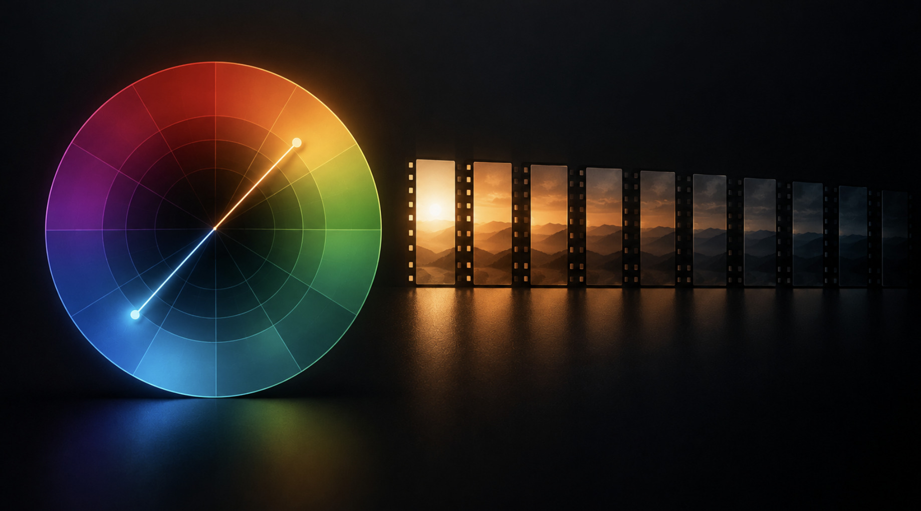
On a standard color wheel, the complement of orange is a blue-green, roughly teal. Placing a warm subject against a cool background maximises color contrast, which helps faces separate from their surroundings and draws the eye to the actors. This principle long predates digital grading. Painters used it, and cinematographers achieved similar effects by mixing warm tungsten light on faces with cooler daylight or moonlight on backgrounds.
The DI made the effect easier to apply consistently. With secondary correction, a colorist can protect skin tones while pushing the rest of the image toward cooler hues, especially in the shadows. The result is the familiar split: warm highlights and midtones on faces, cool shadows and backgrounds.
Commercial imagery rewards legibility
Large commercial productions have strong incentives to make images immediately readable, on screens of every size, in trailers and in marketing. Clear separation between characters and backgrounds helps. A palette that works in a fast-cut action sequence, on a phone screen and on a billboard is attractive for practical reasons, whatever its aesthetic merits.
Convention reinforces itself
Once a look is associated with high production values, it spreads. Colorists build presets, camera departments design on-set lookup tables to preview a grade, and directors show reference images from other films. The pattern became visible enough that a widely shared 2010 blog post by Todd Miro, complaining that many recent blockbusters had been graded the same way, helped popularise the phrase “teal and orange” as a criticism.
None of this proves a single cause. It is better understood as a set of pressures pointing the same way: the physics of skin color, a long-standing principle of complementary contrast, a new tool that made the effect cheap and precise, and a commercial environment that rewards immediately legible images.
What the evidence actually shows
The teal-and-orange story is often told with more confidence than the evidence supports. Two distinctions help.
Darker films are documented
The clearest quantitative evidence of change concerns brightness rather than hue. In a 2011 study published in i-Perception, the psychologist James Cutting and colleagues analysed 160 English-language films released between 1935 and 2010, sampled at five-year intervals, across five genres. They found that average shot length fell steadily, that motion within shots increased, and that films became darker over time. Animation was the exception, remaining relatively bright.
The extremes in their sample illustrate the trend. Those Magnificent Men in Their Flying Machines (1965) was the brightest film measured, with an average luminance of 162 on a scale of 0 to 255, while Harry Potter and the Deathly Hallows, Part 1 (2010) was the darkest, at 72. The authors also showed that the darkening was not explained by the shift from black and white to color, because black-and-white and color films in their sample had very similar average brightness.
The study measured luminance, not hue. It shows that mainstream films became darker, which is consistent with a style that sinks large areas of the image into shadow, but it does not measure how often a teal-and-orange split appears.
The color trend is less rigorously measured
There is far less systematic research on the hue of mainstream films than on their brightness or editing. Much of the discussion of teal and orange rests on visual comparisons of selected frames, which are vulnerable to selection bias. A frame chosen to illustrate a point does not show how often a look appears across a whole film, or how common it is across all releases.
There are also measurement problems. The same film can look very different depending on the version viewed: a theatrical print, a digital cinema package, a standard-definition DVD, a Blu-ray or a high dynamic range stream. Each may have been graded or converted separately. Comparisons between films often unknowingly compare different versions.
A fair conclusion is that the teal-and-orange split is a real and widespread convention in commercial filmmaking since the DI became standard, but the claim that it dominates modern cinema is impressionistic. Many acclaimed films of the same period use very different palettes.
The grade as part of authorship
As grading became central, it also became contested. If color can be changed after shooting, who decides what a film should look like, and can that decision change later?
Alternate versions
George Miller’s Mad Max: Fury Road (2015), shot by John Seale, was released with a highly saturated grade dominated by burnt oranges and deep blues. A separate black-and-white version, released as the “Black & Chrome Edition”, showed that the same footage could support a completely different look. The existence of both versions illustrates how the DI turned color into something that can be revised after release, not only during production.
Restoration and regrading
Digital grading also affects older films. Restorations for high-definition, 4K and HDR release involve new color decisions, because the original photochemical prints can only be approximated digitally and their colors may have faded. When the people involved in the original production take part, the result can be close to their intentions. When the grade departs significantly from the original look, it can provoke controversy. The 2012 Blu-ray of William Friedkin’s The French Connection (1971), supervised by Friedkin himself, was widely criticised for a cooler, altered palette that differed from earlier releases, and its cinematographer, Owen Roizman, publicly disputed the changes.
These cases show that the “true” look of a film is not fixed once it is digital. The grade has become part of authorship, open to revision in a way the photochemical print never was.
Color management and the future of the grade
Modern productions face a technical problem the photochemical era never had: the same film must look right in cinemas, on televisions, on computer monitors and on phones, in standard and high dynamic range. Different displays have different color gamuts and brightness ranges, and footage often comes from several cameras with different color characteristics.
The Academy of Motion Picture Arts and Sciences developed the Academy Color Encoding System, known as ACES, to help manage this. ACES 1.0, its first production-ready release, appeared in 2014. It provides a common framework for converting footage from different cameras into a shared color space, carrying it through visual effects and grading, and producing versions for different displays and archives. Other color-management approaches exist, but ACES is a widely used open standard.
High dynamic range has added another layer. HDR formats allow brighter highlights and more saturated colors than standard television, which means colorists often produce separate grades for different formats. The same scene may legitimately look different in a cinema, on an HDR television and on a standard screen, because each is graded for its medium. This complicates any simple claim about what a film “looks like”.
How to read a grade
For viewers, a few observations make color grading visible.
Watch the shadows and the faces separately. If skin stays warm and natural while shadows, walls and skies lean toward blue-green, the film is probably using a split-tone grade with skin protected.
Notice what is unusually saturated or desaturated. Selective changes, such as one color brought forward while others are muted, are much easier to achieve digitally than photochemically, and often show a deliberate grading decision.
Compare versions where possible. Differences between a cinema release and a home video version, or between an original release and a restoration, often reveal how much of a film’s look comes from the grade rather than from the photography.
Separate grade from production design. Not every color comes from postproduction. Costumes, sets and lighting still determine much of a film’s palette. Grading can push, separate and unify those colors, but it rarely creates them from nothing.
A tool, not a destiny
Teal and orange is the most visible signature of a larger change: the move of color control from the camera and the laboratory to the grading suite. The digital intermediate let filmmakers change specific colors after shooting, relight scenes digitally and give entire films a consistent palette. Cheaper software spread those tools far beyond Hollywood. Complementary contrast, the physics of skin tone and the incentives of mass-market imagery explain why one particular look became so common.
The same tools that produced a recognisable house style also made possible O Brother’s sun-faded South, Fury Road’s alternate black-and-white version and a wide range of palettes that look nothing like the blockbuster norm. The grade itself is neutral. What has changed is that color is now one of the most flexible and most consequential decisions in filmmaking, made long after the camera stops rolling.